Showing posts with label Sonic the Hedgehog. Show all posts

Sunday, July 2, 2017

Sonia and Manik (Mobius 25 Years Later) Redesigns. Why Did I Bother?

     Alright so does anyone reading remember the Sonic the Hedgehog Archie Comics? Okay then...does anyone remember that storyline in the pre-reboot continuity that was the epitome of fan-fiction? You know the one where we got a "glimpse into the future"? Where just about every single main character became a stupid 50s sitcom stereotype?

Except...worse than that?
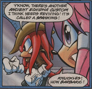


     Yup, I'd say you can blame Ken Penders for that (among some other things, but I digress). Not exactly a fan-favorite story. Barely anything ever happened in it, and not even Ian Flynn's 30 Years Later story was that much better. Besides the ridiculous writing and the 100 other problems with this arc, do you want to know what really gets on my nerves?

The child characters.
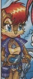


Oh, but this was the Penders run of the comic, infamous for bad designs and outright clones...

So Surely Flynn's run was better right?


     Yeah, and I'm Mickey Friggin' Mouse. Clones as far as the eye can see. 

     Sure I only showed two of them, but do I have to show more? All of them except for Lara Su (who still wasn't that well designed) were like this. Their designs were horrible. Needless to say I hate that mentality of "oh a character's kids can be clones because genetics!" Genetics does not work like that at all. Kids can resemble even the grandparents and it would still make sense. Have more faith in your audience's intelligence, for God's sake. I'm not even joking when I say even the Disney Sequels had better designed child characters than this...not all the time, but they had better ones than this.

     Although the personalities are another story entirely...I'd say M:XYL screwed that up about as bad as the Disney Sequels did....but that's not what I'm focusing on.

     So anyways, I've seen quite a few artists on Tumblr redesign some of these child characters from this arc, and needless to say these guys actually had an understanding of character design. Quite a few of them are quite impressive.

    For the hell of it, I decided to do redesigns of Sonia and Manik, Sonic and Sally's kids from the future storyline.


     Huh...it's been a few days since I actually drew these..,

     Anyways, when I first started these redesigns, the first thing that I did was block out a basic shape to them. In other words, I crafted a silhouette. One of the ideal rules of character design is that you should be able to tell characters apart from purely their shadows or silhouettes. They should have their own shapes and sizes, basically. I kept certain elements of the design in my mind when painting the silhouettes, and then I made a more detailed sketch.  After that, I gave them their colors.

     For the designs, even though I know that it is discouraged by the more grown-up side of the Sonic the Hedgehog fan community, I sort of made a hybrid. Except...I actually put more thought into them and only made minor fusions of parts.

     Manik's tail highly resembles Sally's (a chipmunk mobian) but I kept him as a hedgehog just for the sake of staying "faithful". His eyes are a brighter blue than Sally's and his green fur is a similar color to Sonic's eyes. I thought that giving him black cuffs on his gloves would be a sort of homage to Tails. His shoes are his own, but I did try to make them appear more blocky and angular than Sonic's. Also, like Sally, he has tuft on his cheeks. Furthermore, his hair style is similar to Sally's. I kept in the gap in his teeth.

     In Sonia's case, I straight up gave her Sonic's eyes. She's a squirrel because her granddad (Nigel Acorn) is one. Her outfit is supposed to match her shoes, which are almost like Sonic's, except for the gold cuffs. Her fur is more reddish and darker than Sally's. I also tried to make her eyes look less...elegant than Sally's...or maybe it's more playful or round....Her hair deliberately resembles Sonic's quills. I want to say that her hair is naturally that color. I guess you could also say she dyes it...but I personally wouldn't say that. I also decided to give Sonia a scarf that matches her eyes. I was thinking of Sonic Boom to be fair, but I also thought it could be an element of her design unique to her...

So how do you like them?

I enjoyed doing these quite a bit.
RANDOM PLUG!!!

    Oh, just because I love her work, here is drawloverlala's redesign of Lara-Su.


Go check out her tumblr now, she has a bunch of other redesigns that are seriously awesome!↴

http://drawloverlala.tumblr.com/tagged/My-art

(She also has a deviantart account under the same name!)

Friday, June 16, 2017

I just redid a drawing! With my tablet!


     YAY! I just redid a drawing! It's not 100% finished, but it is at a point where I can show it off.

     Classic Nicole, again!


     I think I am starting to see how I can put more energy into my poses...or how to make them less stiff. I feel so horrible for enjoying digital art sometimes, because traditional art, when done well, is still such a magical thing.

     Nowadays I realize the need for digital art...and I can learn to love it more. On the side I would still love to improve my traditional art skills. And to be fair, I didn't put 110% into the original drawing but I still tried.

     For the colors this time, I actually referenced a panel from the comics. I always had this thing where I'd like to only use common colors so as to keep my work from getting terribly complicated...but for now it's fine. Thank God for the HTML Color Names page (it's something on w3schools that lists the color code and the names of the colors. It's for coding purposes but it helps with art, too.)

     I also would love to do that coloring technique where the colors are these crazy mixes that still appear to be the "correct" colors but are more vivid. I don't know if that's the standard painting technique but I would love to incorporate that. I think it's called optical blending...yeah something like that where the paint strokes are distinct and energetic.

     Anyways, I do like the newer drawing more, because I feel that it is better constructed and that it has more energy to it. I also think the pixel effect is better integrated, and that I drew the little computer better. I'll do shading later, for sure. To further practice with my tablet, I think I will redo some more drawings...

Tuesday, June 6, 2017

My Canvas So Far....


Alright, so here is all of the art that I've done in May (and also some of this month). I've also got some 3D models I've been working on. I really have to catch up on stuff...\

Most of these were done with Prismacolor Pencils.

1.) SomecallmeJohnny Amiibo


There is a meme of sorts among this YouTube reviewer's fanbase. He posted a photo on Twitter with the caption "Amiibo Hunt Successful" and made a deliberately stupid face.
It has now become a meme amongst the fanbase to not only make edits of that photo, but also of other photos that he would post on Twitter later on. I decided to make his actual face an amiibo. I thought it was funny. I exaggerated the original face for added humor.

2.) Dr.Finitevus for Fini


One of the people I follow on Tumblr goes by the user name of Fini-Mun. Yeah, he's kind of a fan of Dr.Finitevus from the Sonic the Hedgehog Pre-Reboot Archie Comics. He's an artist who does amazing Sonic work as well as amazing work period.

He offered his assistance so that I might start commissions online, and this was a thank you gift to him. I don't know...I feel the pose is stiff.....


3.) For Robotnik-Mun


Robotnik-Mun is another person I follow on Tumblr. He's most famous for the hastag Ken Penders is a Douche, where he rightfully riffs on the antics of the infamous Sonic Archie writer/artist Ken Penders.

He has a personal history with Penders' work so the man affects him quite a bit...either way it was fun to read RM for so long, do I drew his favorite Sonic character, SatAM Robotnik. I even put in a caption. "Sir, Ken Penders is at it again!"

4.) For RobotnikHolmes


RobotnikHolmes is another user in my circle of Tumblr blogs that I follow. His blog, RobotnikHolmesComicBlog, saw him reviewing all of the major Sonic Archie comics all the way from the first issue.

After finishing up the dreaded Penders era, he reviewed the first few issues of the Flynn era. He's on break now, but his reviews were very entertaining for me so I felt he deserved something nice. Penders is a slice of pizza here because comedy.

Fun Fact: I actually reference a photo of the Angry Video Game Nerd to draw RH's face.

In the artwork for this OC of his, he delivers pizza so....yeah. I feel like I drew his left eye too low...

5.) Skyline Sonic for DrawLoverLala


DrawloverLaLa is a Chilean artist on Tumblr who primarily draws Sonic art. She draws Sonic style stuff perfectly and her work has a lot of energy and color to it.

Her re-designs of the Archie comic characters and others from Sonic spin-off media are amazing. I just love how she draws.

This is her version of Sonic from what she calls the Skyline Alternate Universe. I tried to put more energy into this...but I don't really feel it.

6.) Classic Bunnie


Now this is part of a series I did where I drew the Freedom Fighters from the Sonic Archie comics "classic" style. I had been wanting to do it for a long time before this, so these were fun.

The first one was Bunnie. Pretty much all of my Classic redesigns are combinations of the SatAM designs, the pre reboot comics, and the reboot comics.

Bunnie has short hair like her SatAM design, but I kept the reboot design in tact. The shoes are simplified and I made sure the leotard looked like a leotard and not part of her body.


7.) Classic Antoine


It seemed appropriate to draw Bunnie's lover boy Antoine next.


I combined the pre-reboot design with the reboot design. I wanted to keep the coat because I felt like that was an important part of the character, but I simplified it and put the band and belt that he wears on top of it.

Plus I gave him the sword. In this picture it's a little crooked...and it sure is big compared to his body.


8.) Classic Rotor


Meh...Rotor's probably my least favorite of the Freedom Fighters, but he's good in his own ways. I love how they gave him a dad in the reboot and made his dad an Egg Boss (One of Eggman's right hand men).

So since he's an inventor or something I gave him a screwdriver. This is primarily his reboot design but I gave him the Classic hat. Also some hair.


9.) Bob's Burgers' Revolver


I love Bob's Burgers (but I haven't seen Seasons 6 or 7...why did Netflix remove this show?) and in recent years I've become a huge fan of the Beatles.

Revolver is one of my favorite albums ever, so just because I wanted to do a humorous parody, which there are plenty of, I drew this.

Since the album cover is black and white, I didn't have to color this. I did however add shading where it existed in the original album cover.

Fans of the show will recognize the little things I put in there. Also I'm sorry about that bottom of the picture...I don't really know what happened there.


10.) Classic Nicole


Oh boy! I've always been a fan of AI characters like Nicole. She's so cute and so cool. Y'know Ian Flynn has said that if he could make her and Sally a couple, he'd do it, and I would totally love to see that.

For this one she has all the accessories of her reboot design, but I gave her the pre-reboot dress. I also decided to add the pixel effects for this one, similar to how she's projected in the comics.

I guess it is a little weird that I went with this face...but I know the original face I did where she had one eye half-closed looked pretty dumb.

This is my favorite out of all of the Classic drawings I did.


11.) Classic Sally


Sally has always been pretty cool when she's written right now that I think about it....


So this design actually has minor alterations since she already has a kid look from the flashbacks in the reboot comics. I wanted to give her a sort of battle-ready, confident pose. I think this pose got a little wonky...mostly because of the limbs...I don't think I stretched them well enough, but I don't hate this. I do think I did well with that simple ethereal effect on the blade.

12.) Zelda 1 Link


Now...THIS. This is the one piece out of all of these that I have sunk the most time into. I gave it a background and shading and everything!

So I've finally properly gotten into the Zelda franchise, and I feel like a fool for not doing it sooner, because I loved Link to the Past and I'm loving Ocarina of Time. I kind of suck at the games, but they're still really fun. So I made a decision to do a series of illustrations of the Links from the multiple games that I am playing as I play them.

I initially played Zelda 1 and 2, but I could not beat either. Still, I decided to include those two in this series. This is the Legend of Zelda 1 Link.

I make sure to reference official art as closely as possible. I like how the magical sword and logo turned out. I'm keeping the first few simple to reflect the simple nature of 8 bit games....I'd better get used to picking a color palette for each piece, because that's the effect that I wish to achieve. I also need to practice texture stuff with Prismacolor pencils... I'm moderately proud of this piece.

I can't wait to get better and do the others!!


So yeah, those are the highlights of my 2d art from this past month.

I have to do much more drawing to do better pieces, especially because I eventually want to do graphic novels.

Once I open up commissions, I hope that helps me improve.